My stop loss has been hit and I had to sell. I am down to my core position and fully aware that I might have sold the bottom but there is no excuse to ignore my own rules so I stuck to discipline.
The basic theses for my using of the SKI indices in conjunction with the classical TA is that the valid signals come simultaneously across different systems and across different vehicles. The idea was born in the aftermath of the 2008 'life run' disaster when the signal failed and USERX went on further 40%+ drop before the bottom was established. After the fact, I was trying to analyze data and find out if there was a method that would have given me the warning that something was wrong with the signal. The answer was yes there was, on 22nd Sept, 12 days after the 'life run', USERX generated a juxtaposed 16-20 buy which was short term bearish but given the context of the 'life run', it wasn't such a big deal. But then there was this other thing, while the USERX and all other gold indices were rejected by the 16-20 resistance, gold itself was generating a very bearish 16-20 and 92-96 double sell! The 'life run', because it is such a specific tool that applies only to the USERX, didn't have much value in comparing it with other indices but the rejection of the 16-20 aligned with the powerful sell signal in gold should not have been ignored. It was a red flag.
Following this event, I went back and started analysing synchronicity of the SKI signals across the gold indices and later across other sectors and in combination with other methods. My finding was that the SKI indices work the best with the vehicles that have a wide audience behind their trading. This means SKI works well with commodities, currencies, any widely used indices or even some household name company shares like Microsoft or Apple. Also, I found that a good method to bring clarity to SKI signals is to combine them with the traditional TA and vice versa.
I am saying all this to get to the point which would be to describe the confusion that the last week has incited in me. When I go through the charts I cannot be sure anymore what is happening. The markets are being pushed to the brink but there is still not a decisive signal pointing into one direction so I decided to obey my stops and go back to the core position.
In my descriptions of the charts that will follow you will see how almost every market is in this dual position where a small move in one or the other direction can lead to two totally different outcomes.
USERX
USERX price generated a 35-39 sell signal, which was my stop loss level, so I sold. But it is not that simple. Ever since the November low, I believed that the sector is in a 'wall of worry' kind rise that eventually will lead into the new bull market by the first week of February, if not earlier. The only condition for this to happen was for the price to stay inside the rising channel that started back in May 2019. I suggested ignoring all SKI signals while inside this channel. Price obliged and everything looked fine till 20th Jan. The upward and the downward support/resistance lines were crossing on the 20th of Jan and I was pretty sure that beyond this date the only obstacle left would have been 16-20 and 92-96 echo with a setup for a possible bullish outcome either in the form of a single or a double buy signal. The other possible path was the 35-39 sell which would lead to falling out of the channel therefore bearish. When the 20th Jan arrived the price came down right to that crossing point and generated the 16-20 buy signal and bounced back immediately and everything looked fine, support holding resistance giving up. Unfortunately, the very next day the price suddenly reversed and subsequently sold the 35-39 echo and fell back into the downtrend channel. It all looks bearish now but if we zoom out a little bit there is more to it. The November low has been marked with the touch of the support of a lesser degree, the one going back to September 2019 which still could be the limit of this breakdown but this time I cannot bet my money on it because the chart structure doesn't support it. If we, for any reason, jump back to 13.50ish, the original target for the first week of February, we will have a bull market break out. This time though the odds are not on our side. On the other hand, it is only 4.2% rise needed to flip the situation. That is something that gold shares can do at any time in any market conditions even intraday (like they actually did in the last two days).
As I will discuss later there are setups in other markets that can trigger some serious pullbacks and that is why given the gold signals I cannot take the risk of ignoring them and stay long for another few days until the situation clears.
The last few days there was increased volatility in the markets generated by different issues: promised but postponed fiscal stimulus, short squeeze scandal, hysterical share price levels of some major companies, repositioning for the anticipated 'Biden economy' policy changes, etc... Given all this, I am not even sure that for the short term outcome the charts matter as much as they normally do. The system is starting to leak water everywhere and I am happy to step aside to see what happens.
One more thing, my personal feelings went from being worried to being outright scared to be 100% long. This is actually bullish because I often sell bottoms and buy tops. Luckily over time, I learned to reverse these mistakes quickly if needed.

Important levels to watch:
on Monday 8th Feb the highest USERX price to beat will be $13.41, higher than that and both 35-39 and 92-96 will buy. The actual buys could, in fact, be generated at lower levels but it all depends on the price trajectory.
If the secondary support line (from Sept 2019) doesn't hold the obvious first target is the lower boundary of the downward channel that coincides with the 38% fibo level of the March rally. That support would be between $11.10-$11.41 (-14% from the current level). If this support doesn't hold the next firm support is 50% fibo from the March rally that coincides with the 2016 high at $10.28 (-20% from the current levels). The final support is at the 62% fibo at $9.35 but we better not go there because that would sell the long term 218-222 echo and we will officially stop the bull market.
It is worth looking at the weekly USERX chart as well. I mentioned before how the weekly chart sports a gigantic shallow pan pattern. The left side emerged in 2013 with the breakdown of $13.75, the middle was marked with the 2016 rally to $10.28 and the right side started closing with the 2020 rally above the 10.28 to reach the August high. It all looks technically perfect and healthy. It is obvious from this chart that the difficulty to stay above $13.75 is not by chance, since Aug the price managed to close above this level for only three weeks. Also, it is visible that the $11.74-$12.22 is an area of support. Currently, the secondary uptrend line stays at $12.22 so this confirms that this level is worth watching. The weekly resistance is now represented with 8week and 21week MAV and they are respectively $13.15 an $13.31 which is in line with the breakout level prescribed by SKI at 13.41. 

The same important levels are signalled by different methods so let's see what happens.
XGDA - Australian gold stocks
Usually, I present the Australian gold index at the end but this time I will do it first because it is so different from all other indices and also since early 2019 it has been a leading indicator at all major junctures.
Prior to the November plunge, the XGD generated 35-39 and 92-96 sell signal around 38% fibo level and that led to a severe crash much stronger than the USERX and other gold indices. The low was marked with the touch of the 218-222 echo. The similar touch in March has marked the final low so when this one held I thought the worst is over and we will spring back to the upper boundary of the downward channel as a prelude to the breakout. Instead, a megaphone pattern developed inside the channel with lower lows and higher highs. This kind of pattern is psychologically but also technically the most difficult to hold on because it repeatedly triggers stops and breakouts and then instantly reverses. This third lower low triggered my stops. The problem is in Australia everything looks and feels like the bottom. If that is true we should spring straight back to the upper boundary of this megaphone pattern which is currently positioned slightly above $8000 level (+13%). That would be a good omen for the USA gold stocks. A failure to do so will lead to the fall down to the very long term support line emanating from 2015 low ($6500, -8%). Unfortunately, such an event would most probably lead to the sell of the 218-222 echo and that would change the character of this market to bearish. 

HUI
Hui sold the 35-39 echo and is in a similar configuration like the USERX with the most important level $286.05 barely holding. Not a good position and it requires an instant reversal of the trend to buy back the 35-39 echo ($312.05, +10%).
An immediate lower level target sits at 50% fibo $256.66 (-9.5%). If that cannot hold the next target is at 62% fibo $229.63 (-19%).

XAU
XAU also sold the 35-39 but instantly jumped back inside the contracting triangle and is sitting at the apex now. A slight move up will trigger strong double buy, a similar move down will break the support at the apex and lead to a strong move down. The time is up.

GDX is similar to HUI but the support lines have not been violated so the technical picture is practically unchanged from the last week. The all-important 2016 high level is still intact. This is a stronger position than the USERX and HUI.

GDXJ
GDXJ is weaker than any other gold index. The 35-39 sell has happened at bellow the important 2016 high which therefore corroborates the sell. On the other hand, the price is still above the trend line and has some more space to move in that regard. Not particularly strong configuration but the bullish setup exists not far above the current level.

GLD
The gold chart is hanging by a thread. The price is positioned at the very pinnacle of the contracting triangle. There is absolutely no room to wiggle, the smallest move will now produce the break of the triangle either up or down. Above, there is a setup for a double buy, bellow for a quick fall to the lower boundary of the channel. There is strong support at the November low at $166 (gold equivalent price $1777) and the next one at the lower boundary and fibo 62% of the March rally at $158 (gold equivalent price $1690).

SLV
The silver chart doesn't jive with the gold indices or the gold itself. If nothing catastrophic is about to happen the price of silver is going to buy the 92-96 echo for a potential bull market. The question is if it is going to be on the path of trades or not. That depends if it is going to trigger the buy before or after the 16-20 sell. The preferable scenario is after the sell because then the buy will be a true bull, all in, signal.
I guess this chart is good news for the gold bull case. The problem is it could be a consequence of the Reddit short squeeze story that has been unfolding in the markets since the last week and it could fizzle out at any moment. It is also possible that it is a harbinger of an explosive move that will blow out many naked shorts out there. It is hard to believe that the Reddit crowd has the necessary energy but the important thing is that this is an excellent illustration of how the charts might be temporarily irrelevant.

S and P 500
SandP is about to buy the 16-20 echo. The last time this happened was in Oct 2020 and it marked the exact low of the short term correction. The problem is that this time the potential buy level is aligned with the neckline on the 1h chart and also with the daily support. If this level is about to be breached there is also the 35-39 echo just underneath it and if this index sells the S and P could be very vulnerable to an instant sharp drop all the way to 3400, the October 2020 breakout level. I think that the S and P is the chart to watch on Monday. If there is a weakness it could break down by the end of the day. Given the recent weakness of the gold and the gold stocks manifested every time the S and P was weak this setup might be a danger for the gold market.


an even better illustration of this setup is the one-hour chart of Tesla

and Apple

As I wrote repeatedly I have been watching this chart for the confirmation of the extended bull market in equities. The preferable scenario for the gold market was the breakout of this chart to confirm the bull market and start the final SandP rally to above $4000 for the final top (into March/April?) before the deflationary crash which would take everything down and launch the bear market rally for the dollar. The gold was supposed, in such a scenario, to rally up with the SandP and then come crashing down before the decoupling happens and the inflationary cycle starts.
Well, this is clearly not happening. The TRAN is about to generate the unwanted double sell while, at the same time, the most critical resistance level rejects further advance and leads to the possible breakdown of the uptrend. This development clearly is adding to the dangerous nature of the current SandP setup. If it transpires it would probably be wise to take a dollar long position.

TLT - long bonds ETF
TLT chart looks horrible. It is as bearish as it gets. It recently sold the long term 218-222 echo, it is far below the long term uptrend line and the path of least resistance is down. This doesn't mean that the FED is not going to jump in and start pushing it up which is another good example of how the charts might be irrelevant here but...What if they decide to just let it fall, a sudden sharp rise in interest rates will prick the SandP bubble and take everything down and launch the dollar rally. That would be a good and necessary overture for the 'big reset' and would probably eliminate any political opposition that the new administration would have in implementing new policies, especially when we know that some of them will be along the line of the 'new deal' equivalent (great reset, new green deal) and therefore opposed by many. When one thinks about it, it is probably more opportune for them to let the market deflate now and then introduce the new measures in the aftermath and build on them until the next election cycle than to try to save this market now and then have an uncontrollable political situation in the future when they need it the least. If they do it now they can easily blame it on covid and Trump and then take credit for 'saving' the economy by opening spigots of monetary and fiscal easing. This is just my stupid speculation but who knows?
Anyhow, this thing screams danger!

UUP
Like all the other charts the UUP is at an important juncture. A small move up or down and it will trigger a buyable 35-39 buy signal or the continuation of the downtrend. The potential 35-39 buy is perfectly aligned with the resistance line and, as I explained before, that is what makes good tradable signals. The potential 16-20 buy is not a potent signal for the further decline since it is actually buyable short term support.
This is again one more chart that adds to the vulnerability of the S and P chart. 

Bitcoin
Finally deflating. The 16-20 buy signal provided an instant rally but there is a potential double sell looming at the $36000 level in two weeks time.

Inflation expectations
The inflations expectations are continuing the rally but the recent action looks toppy (double top?). If it goes into a correction that will contribute to the dangerous side of the S and P setup. 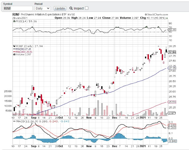

As you probably could already conclude yourself I am of the opinion that this market is at a very critical juncture, the gold market included. We are still in the position to arrive at my desired destination via continued climbing the wall of worry but if we get there it will certainly be along an impossible route. Markets tend to do that and it wouldn't be the first time that everyone got fooled until the final hand was shown. The technicals are against us but the fat lady hasn't sung yet. There is a case to make that charts don't even matter at this point.
The current state of the charts, if they matter, is also a good illustration of how SKI setups in different markets work in unison and provide value to interpreting signals.
I am holding my core position (gold and silver bullion mostly). I am pretty sure that we are entering a volatile period with the possibility of an ugly market crash. The other possibility is a reignited rally that might or might not come after a scary short term correction (maybe to buy the 16-20 echo in SandP). I am not able to call it either way but the high probability of some strong moves is certainly written in the charts.
Best luck to everyone,
Branko
No comments:
Post a Comment